APR
2014
All the designing and development tools and techniques in the world would not be of any consequence if there are no leads. Thus incorporating calls-to-action is an indispensable part of a great and successful website. Before we get any further, it is imperative that the term is understood properly.
Call-to-action: the button or label on your website that would prompt some response from the user, after having spent some time on the website, it maybe a contact form or a newsletter signup.
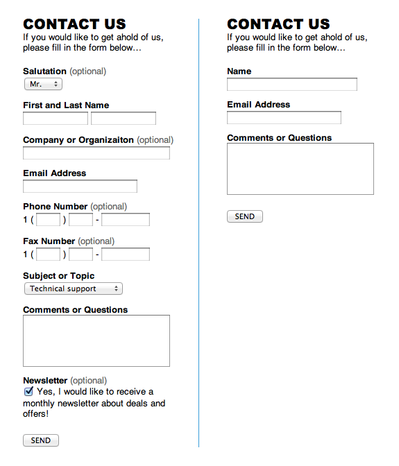
However, there are a few basic elements that need to be remembered: the form should not bore the user away. If the form is long and appears tedious then the visitor may just bounce off and, you may be left sans any conversion / leads, despite having great content. Even the structure and the way the labels are placed, create an illusion of long form. This maybe illustrated via an example:
Examples of Effective Contact Forms
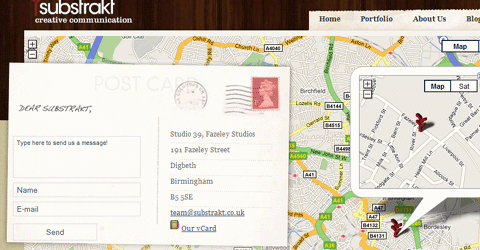
1. Including address and an interactive map: this appears to be the most reliable way of asking information from the visitor. This is because you are establishing a two-way communication line, instead of merely asking for information, and keeping your details (company’s contact details) obscure.
Source: Substrakt
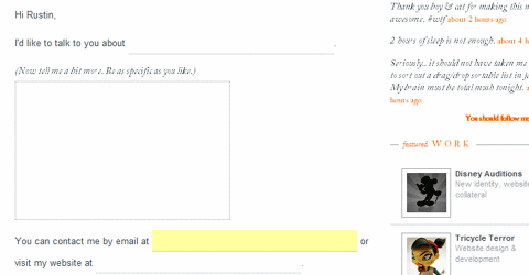
2. A free-to-communicate form: this ideally has a large message box, and the entire layout is in the form of a fill-in-the-blanks template:
Source: RustinJessen
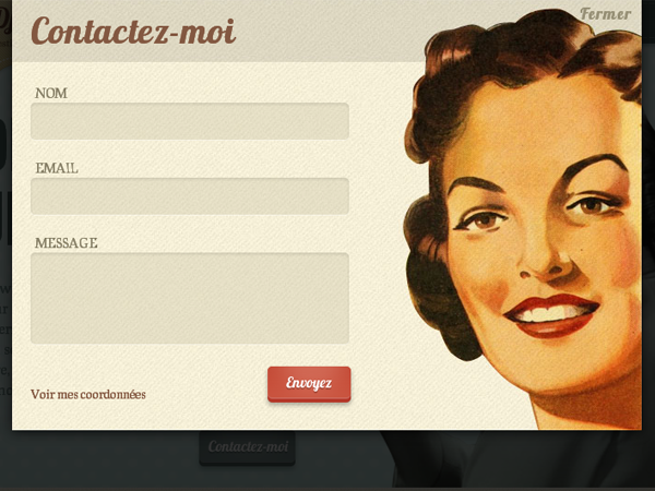
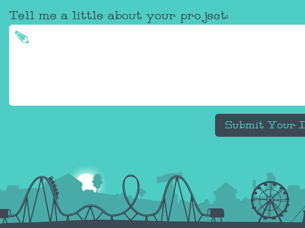
3. Innovative and eye-catching layout: maybe with an interesting colour-scheme that has a retro feel to it. A great example may be:
Source: Jessica Jafaar
4. Simple form: devoid of all the fancy design shenanigans, a simple layout asking for basic information details works just as well:
Source: SecondandPark.com
5. Going innovative with the language used and / or giving a real-time feel: for instance, a 3-D effect that gives the impression of a real postcard that the user is signing may attract and hold his / her attention for the time that he is filling out the form.
Source: Substrakt
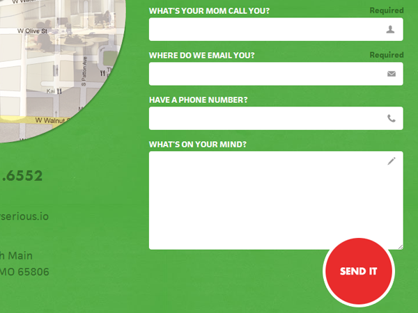
6. Labeling the questions in an innovative manner: the idea is to ensure that the user does not get bored for as long as the form is being filled out.
Source: Mostlyserious
7. Designing the form such that it blends in with the rest of the website, yet stand out: this juxtapositioning of the two approaches may at best be brought out by the following example (however, keep the fields to a mere couple):
Source: DeniseChandler
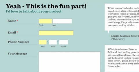
8. Cleverly-worded form, with a soothing background and color-scheme:
Source: MilkandPixels
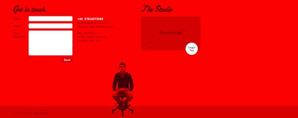
9. A strong-colored layout like the example given below would also help grab eyeballs and act as an effective call-to-action:
Source: StudioChirpy
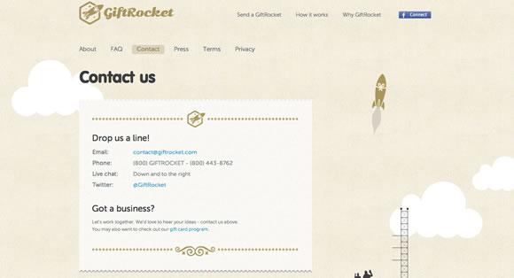
10. Eliminating any fields whatsoever and revealing all ways of contacting yourself: this approach works because it seems as the least intrusive, creating the impression that sensitive identity details are not being pried out of him:
Source: GiftRocket
A few tips to create an effective contact form
Since this is the contact point between your user and you, the form is a critical feature that should contain these elements:
- User should be assured of security: since an ideal form requires an email id, contact number and real names, the visitor should be assured of confidentiality of the same.
- Assurance that sharing the email id would not imply regular spam mail from the company or the business partners and advertisers
- The number of fields required to be filled should be as few as possible
- keep a free-to-express message box, through which the user would be able to contact and connect with you in his/her own way
- The above label should be as big and spacious as possible.
- Do not keep the newsletter sign-up option ticked on, as this might irritate some users.
- Keep other options of communication open, via contact numbers, email id and address of the nearest office.
- Keep the layout uncluttered: the user should not get confused and be left navigating his/her way around the form labels.
Remember the idea is to encourage interaction and increase sales, not to appear intrusive and drive the visitor away.
Do you want to improve your website’s user experience? A Few tweaks can make a big difference. Speak to our design consultant on +91 8826 175930 or mail us at info@enablingbiz.com
